Data visualization is a powerful technique that transforms raw data into visually appealing and meaningful representations. In this digital age, where data is abundant and complex, it has become crucial to present information in a way that is easily digestible and facilitates better understanding. By leveraging the capabilities of data visualization, you can unlock valuable insights, identify patterns and trends, and communicate data-driven narratives effectively.
What is Data Visualization?
Data visualization refers to the process of representing data and information in a visual or graphical format. It involves creating charts, graphs, maps, and other visual elements to present complex data sets in a clear and concise manner. The primary goal of data visualization is to communicate insights, patterns, and relationships that may be difficult to discern from raw data alone.
Why is Data Visualization Important?
The importance of data visualization lies in its ability to simplify and enhance data understanding. Here are key reasons why data visualization is crucial:
- Enhanced Data Comprehension: Visual representations simplify complex data sets, making it easier for users to grasp and interpret the information at a glance. By presenting data visually, patterns, trends, and outliers become more apparent, leading to better insights.
- Improved Decision-Making: Data visualization empowers decision-makers to make informed choices based on data-driven insights. Visualizing data allows decision-makers to identify correlations, spot emerging trends, and understand the impact of different factors, leading to more effective strategies and informed decisions.
- Efficient Communication: Visualizations offer a common language that transcends barriers and facilitates effective communication among diverse stakeholders. By presenting data visually, complex ideas can be conveyed concisely, enabling better understanding and alignment across teams.
- Identification of Patterns and Trends: Visual representations help identify patterns, trends, and outliers in large datasets. By leveraging the human visual system’s ability to recognize shapes, colors, and spatial relationships, data visualization enables the discovery of hidden insights and facilitates data exploration.
- Engaging Presentations: Visualizations make presentations more engaging, captivating, and memorable. By incorporating charts, graphs, and other visual elements, data storytellers can effectively convey their message, capture attention, and leave a lasting impact on the audience.
Benefits of Using Data Visualization Techniques
Data visualization techniques offer numerous benefits that extend beyond data understanding. Here are some key advantages of utilizing data visualization:
- Clarity and Simplicity: Visualizations present data in a simplified and intuitive manner, allowing users to quickly grasp complex concepts. By reducing cognitive load, visualizations enhance clarity and simplify the process of extracting insights from data.
- Identification of Patterns and Relationships: Visualizations enable users to identify patterns, trends, and relationships that may not be immediately apparent in raw data. By representing data visually, correlations and connections become more visible, helping users derive meaningful insights.
- Effective Storytelling: Visualizations serve as powerful storytelling tools, allowing data analysts to convey narratives and communicate data-driven stories effectively. By combining data with compelling visuals, storytellers can engage the audience, build persuasive arguments, and support their conclusions.
- Data Exploration and Discovery: Visualizations encourage exploratory data analysis, enabling users to interact with data, drill down into details, and uncover hidden patterns. By providing interactive features, visualizations empower users to manipulate data, ask questions, and gain deeper insights.
- Data-Driven Collaboration: Visualizations foster collaborative discussions around data. By presenting information visually, team members can align their understanding, share insights, and collaborate on data-driven projects effectively.
- Enhanced Presentation and Reporting: Visualizations enhance the visual appeal and impact of presentations and reports. By incorporating charts, graphs, and infographics, reports become more engaging, memorable, and persuasive.
Common Types of Data Visualization
Data visualization encompasses a wide range of techniques and chart types, each suited for specific types of data and objectives. Here are some common types of data visualizations:
- Bar Charts: Bar charts represent categorical or discrete data using rectangular bars of varying lengths. They are effective for comparing data across different categories or groups.
- Line Graphs: Line graphs display the relationship between two variables over time or continuous scales. They are useful for illustrating trends, changes, and patterns.
- Pie Charts: Pie charts represent proportions or percentages of a whole by dividing a circle into segments. They are suitable for showcasing the distribution of categorical data.
- Scatter Plots: Scatter plots display the relationship between two numerical variables as individual data points on a graph. They are ideal for identifying correlations, clusters, and outliers.
- Heat Maps: Heat maps use colors or shading to represent data values across a matrix or grid. They are useful for visualizing patterns, densities, and variations in large datasets.
- Treemaps: Treemaps depict hierarchical data structures using nested rectangles. They are effective for representing proportions and hierarchies within a dataset.
- Network Graphs: Network graphs visualize relationships and connections between entities as nodes and edges. They are valuable for showcasing social networks, supply chains, and complex relationships.
These are just a few examples of the many data visualization techniques available. Choosing the right visualization type depends on the nature of your data, the insights you want to convey, and the preferences of your target audience.
How to Prepare for Data Visualization
Before diving into data visualization, it is essential to lay the groundwork for a successful visual exploration. Here are the key steps to prepare for data visualization:
1. Gathering and Cleaning Data
To begin, collect the relevant data that you want to visualize. Ensure that the data is accurate, complete, and well-structured. Remove any duplicates, inconsistencies, or outliers that may affect the integrity of your analysis. Use data cleaning techniques such as filtering, sorting, and formatting to make your data suitable for visualization.
2. Choosing the Right Data Visualization Tool
Selecting the appropriate data visualization tool is critical to your success. Consider factors such as ease of use, compatibility with your data format, available chart types, and interactive features. Popular tools include Tableau, Power BI, and Google Data Studio, each offering a range of functionalities to cater to different visualization needs.
3. Understanding the Target Audience and Their Needs
To create impactful visualizations, it is essential to understand your target audience and their specific requirements. Identify the key stakeholders who will interact with your visualizations and determine their level of expertise, domain knowledge, and preferred visualization styles. Tailoring your visualizations to suit their needs will enhance the effectiveness of your communication.
How to Select the Right Visualization Technique?
Choosing the appropriate visualization technique is crucial to effectively represent your data and convey insights. Keep the following aspects in mind when selecting the right visualization technique:
Understanding the Different Types of Data Visualizations
There are numerous types of data visualizations, each suitable for different data types and goals. Familiarize yourself with common visualization types, such as bar charts, line graphs, scatter plots, pie charts, heat maps, and more. Understand their strengths, limitations, and use cases to make informed decisions.
Matching Visualization Techniques to Data Types and Goals
Different data types require specific visualization techniques for accurate representation. For example:
- Use bar charts for comparing categorical data.
- Utilize line graphs to showcase trends over time.
- Opt for scatter plots to illustrate relationships between variables.
- Employ heat maps to display patterns in large datasets.
- Consider tree maps to visualize hierarchical data structures.
Exploring Popular Data Visualization Tools and Libraries
Familiarize yourself with popular data visualization tools and libraries, such as D3.js, Matplotlib, ggplot2, and Chart.js. These tools provide a wide range of pre-built visualization templates and customizable options. Explore their documentation, tutorials, and community resources to leverage their full potential.
Design Principles for Effective Data Visualization
Design plays a vital role in creating visually appealing and impactful data visualizations. A few principles to enhance the effectiveness of your visualizations include:
Choosing the Right Chart Types and Layouts
Select chart types and layouts that best represent your data and support your narrative. Ensure that the chosen visual elements are appropriate for the data type and accurately convey the intended message. For instance:
- Use stacked bar charts for comparing parts to a whole.
- Consider line graphs for illustrating trends and changes over time.
- Utilize scatter plots to depict correlations or clusters.
Using Colors, Fonts, and Visual Elements Effectively
Carefully choose colors, fonts, and visual elements that complement your data and reinforce your message. Follow these guidelines:
- Use a consistent color scheme to represent different categories or data points consistently.
- Ensure sufficient contrast between colors for better accessibility.
- Select fonts that are easily readable at different sizes.
- Utilize visual elements like labels, legends, and annotations to provide additional context and guide the reader.
Enhancing Readability and Clarity in Visualizations
Ensure that your visualizations are clear, concise, and easy to interpret.
- Label data points, axes, and legends clearly.
- Avoid cluttering the visualization with unnecessary elements.
- Use appropriate scales and units to represent values accurately.
- Provide tooltips or captions to offer additional information on demand.
By applying these design principles, you can create visually engaging and informative data visualizations that effectively convey your message.
Exploratory Data Analysis and Visualization
Exploratory data analysis (EDA) involves using visualizations to gain insights, discover patterns, and identify outliers in your data. Here are key techniques to conduct EDA effectively:
Techniques for Exploring Data and Finding Patterns
- Generate histograms or bar charts to understand the distribution of numerical or categorical variables.
- Utilize scatter plots to identify relationships and correlations between variables.
- Create box plots to visualize the distribution and identify outliers.
Uncovering Relationships and Correlations
- Use scatter plots to examine the relationship between two numerical variables.
- Apply heat maps to visualize correlations between variables in large datasets.
- Calculate correlation coefficients (e.g., Pearson’s correlation) to quantify the strength and direction of relationships.
Identifying Outliers and Anomalies
- Employ box plots or violin plots to identify outliers in your data.
- Utilize statistical methods such as Z-scores or interquartile range (IQR) to detect and handle outliers.
Exploratory data analysis through visualization allows you to gain valuable insights, detect patterns, and identify potential data anomalies.
How to Create Interactive Data Visualizations?
Adding interactivity to your data visualizations can greatly enhance user engagement and exploration. Here are key techniques to create interactive data visualizations:
Adding Interactivity to Enhance User Engagement
- Implement interactive elements such as hover effects, tooltips, and highlighting to provide additional information on demand.
- Include zooming and panning capabilities to enable users to explore detailed areas of interest.
Incorporating Filters, Tooltips, and Zooming Features
- Provide filter options to allow users to customize the displayed data based on their preferences.
- Include tooltips that show more detailed information when users interact with specific data points.
- Enable zooming to allow users to explore the visualizations at different levels of granularity.
Implementing User-Driven Interactions and Drill-Down Capabilities
- Allow users to interact with the visualization by selecting specific data points or categories of interest.
- Implement drill-down capabilities to enable users to explore hierarchically organized data in a structured manner.
By incorporating interactivity into your visualizations, you empower your audience to explore the data and discover insights at their own pace.
Data Visualization Tools
Data visualization tools empower users to create stunning visual representations of their data. Here are some popular categories of data visualization tools and examples of tools within each category:
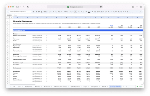
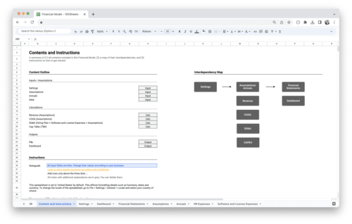
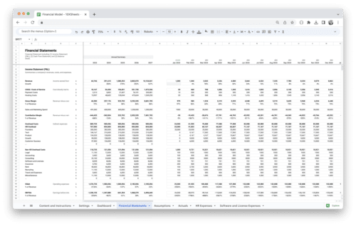
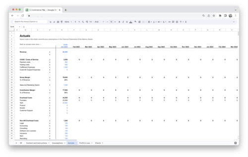
Spreadsheets
Spreadsheets serve as a fundamental tool for data organization and basic visualizations. While not dedicated data visualization tools, they offer basic charting capabilities for simple visual representations. Examples include:
- Microsoft Excel: Widely used spreadsheet software that provides various chart types, customization options, and basic data analysis features.
- Google Sheets: Web-based spreadsheet software that offers charting capabilities, collaboration features, and seamless integration with other Google services.
Business Intelligence (BI) Tools
Business Intelligence tools offer comprehensive data visualization and analysis capabilities, allowing organizations to derive insights from their data. Examples include:
- Tableau: A powerful BI tool that offers a wide range of visualizations, interactive dashboards, and advanced analytics features.
- Microsoft Power BI: A business analytics tool that enables users to create interactive reports, custom dashboards, and visually appealing data visualizations.
- QlikView: A data discovery and visualization platform that offers interactive visualizations, associative data indexing, and drag-and-drop features.
Data Visualization Libraries and Frameworks
Data visualization libraries and frameworks provide developers with tools and resources to build custom visualizations within their applications. Examples include:
- D3.js: A JavaScript library that allows developers to create highly customizable and interactive data visualizations using web standards (HTML, CSS, SVG).
- ggplot2: A data visualization library for the R programming language that provides a flexible and elegant system for creating a wide range of statistical graphics.
- Plotly: A JavaScript graphing library that enables users to create interactive and dynamic visualizations with support for multiple programming languages.
Mapping and Geographic Visualization Tools
Mapping tools specialize in visualizing spatial data and geographic information. Examples include:
- ArcGIS: A powerful mapping and analytics platform that enables users to create interactive maps, perform spatial analysis, and visualize geographic data.
- Carto: A cloud-based platform that allows users to create and share interactive maps with advanced styling options and spatial analysis capabilities.
- Leaflet: A JavaScript library for creating mobile-friendly interactive maps that can be easily integrated into web applications.
Infographic and Presentation Tools
Infographic and presentation tools focus on creating visually appealing and engaging static or interactive visualizations. Examples include:
- Canva: A web-based graphic design platform that offers a wide range of templates, icons, and visual elements for creating infographics and other visual content.
- Adobe Illustrator: A professional vector graphics editor that allows users to create custom illustrations, infographics, and visualizations with advanced design capabilities.
These are just a few examples of the diverse range of data visualization tools available. Depending on your needs, data expertise, and preferences, you can choose the tool that best suits your data visualization requirements.
Storytelling with Data Visualization
Storytelling with data visualization is an effective way to engage your audience and communicate complex insights. Follow these guidelines for effective data-driven storytelling:
Constructing a Narrative Using Visualizations
- Identify the key message or story you want to convey with your data.
- Sequence your visualizations in a logical flow to guide the audience through the narrative.
- Use transitions and annotations to connect and explain different visualizations within the story.
Creating a Logical Flow in Data Storytelling
- Begin with an engaging introduction that hooks the audience and presents the problem or context.
- Develop the story by presenting visualizations that build upon each other, providing insights and supporting the narrative.
- Conclude with a clear and actionable takeaway or call-to-action based on the insights derived from the visualizations.
Incorporating Annotations and Annotations to Guide the Audience
- Use annotations to provide context, explanations, or insights on specific data points or trends within the visualizations.
- Incorporate titles, captions, or headings to guide the audience’s attention and emphasize key points.
By applying storytelling techniques to your data visualizations, you can effectively engage your audience and leave a lasting impact.
Advanced Data Visualization Techniques
Take your data visualization skills to the next level with advanced techniques that enable you to tackle complex data scenarios. Explore the following techniques:
Geographic and Map-based Visualizations
- Utilize choropleth maps to represent data distribution across regions or countries.
- Implement bubble maps to display data using varying bubble sizes on a geographic map.
- Create heat maps to showcase spatial patterns or density of data points.
Network and Graph Visualizations
- Construct network graphs to visualize relationships and connections between entities.
- Apply force-directed layouts to represent complex networks with nodes and edges.
- Utilize graph visualization libraries to create interactive and visually appealing network visualizations.
Hierarchical and Tree Visualizations
- Implement tree maps to display hierarchical data structures with nested rectangles.
- Use sunburst or icicle charts to showcase hierarchical relationships and proportions.
- Utilize collapsible tree diagrams to represent hierarchical data in a visually engaging manner.
By mastering these advanced data visualization techniques, you can effectively visualize complex data structures and uncover valuable insights.
Visualizing Time-Series Data
Time-series data visualization allows you to analyze and understand data patterns over time.
- Utilize line charts to illustrate trends, changes, and patterns over a specific time period.
- Apply area charts to showcase cumulative values or proportions over time.
- Implement stacked area charts to display multiple time-series datasets with cumulative values.
- Utilize heat maps or calendar heat maps to represent time-dependent data patterns.
When visualizing time-series data, consider the granularity of the time intervals, the appropriate scales for the data, and the selection of colors that effectively convey the temporal information.
Visualizing Big Data and Complex Data Sets
Visualizing large and complex datasets requires specialized techniques and considerations. Here are some approaches to effectively visualize big data:
- Implement data aggregation techniques to reduce the complexity and size of the data.
- Utilize interactive filtering and brushing techniques to explore subsets of the data dynamically.
- Employ data binning or sampling methods to summarize and represent large datasets.
- Utilize parallel coordinates or scatterplot matrices to explore multivariate relationships in large datasets.
Consider using visualizations that allow for drill-down capabilities or interactive exploration to navigate through the complexity of big data and extract meaningful insights.
Data Visualization Best Practices
To ensure that your data visualizations are effective and impactful, follow these best practices:
Ensuring Accessibility and Inclusivity
- Choose color schemes that are accessible to individuals with color vision deficiencies.
- Provide alternative text descriptions (alt tags) for visual elements to accommodate visually impaired individuals.
- Consider using interactive features that can be accessed by individuals with mobility or dexterity limitations.
Optimizing Visualizations for Different Devices and Screen Sizes
- Create responsive visualizations that adapt to various screen sizes and orientations.
- Test your visualizations on different devices and browsers to ensure consistent performance and legibility.
Conducting Usability Testing and Gathering Feedback
- Test your visualizations with representative users to identify any usability issues or areas for improvement.
- Gather feedback from your audience or stakeholders to understand their interpretation and perception of the visualizations.
- Iterate and refine your visualizations based on user feedback and observations.
By adhering to these best practices, you can ensure that your data visualizations are accessible, user-friendly, and effectively communicate insights to a wide audience.
Data Visualization Examples
Data visualization is a versatile tool that can be applied to various industries and domains. Let’s explore some real-world examples of data visualization in action:
Healthcare
- Epidemiological Heat Map: Visualizing the spread of diseases, such as COVID-19, through heat maps helps identify high-risk areas and guide public health interventions.
- Patient Monitoring Dashboard: Real-time visualizations of patient vital signs and health indicators allow healthcare professionals to monitor patients’ conditions and detect anomalies quickly.
- Medical Imaging Visualizations: Visualizing medical imaging data, such as MRI or CT scans, enables doctors to interpret complex anatomical structures and detect abnormalities more effectively.
Finance
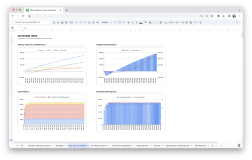
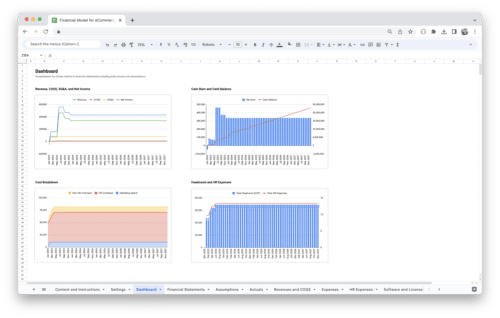
- Stock Market Trends: Candlestick charts and line graphs are commonly used to visualize stock market trends, enabling investors to make informed decisions based on historical price patterns.
- Portfolio Performance Dashboard: Visualizing the performance of investment portfolios through line graphs or bar charts allows investors to track and analyze their investments’ growth and returns.
- Fraud Detection Visualization: Network graphs and anomaly detection visualizations help identify fraudulent transactions or suspicious patterns in financial datasets.
Marketing and Sales
- Sales Funnel Visualization: Funnel charts illustrate the stages of the sales process, allowing businesses to identify bottlenecks and optimize their conversion rates.
- Customer Segmentation Visualizations: Pie charts or bar charts can display customer segmentation based on demographics or purchasing behavior, helping businesses tailor marketing strategies to specific target groups.
- Social Media Engagement Metrics: Line graphs or area charts can visualize social media engagement metrics, such as likes, shares, and comments, enabling marketers to track the impact of their campaigns over time.
Environmental Science
- Climate Change Visualizations: Heat maps, line graphs, and animated visualizations can effectively communicate the impact of climate change by showcasing temperature variations, sea level rise, or carbon emissions.
- Geospatial Visualizations: Maps and choropleth visualizations help analyze geographical data related to environmental factors, such as air pollution levels or deforestation rates.
- Weather Forecast Visualizations: Radar maps and interactive weather visualizations enable meteorologists and the public to understand and track weather patterns, forecasts, and severe weather events.
Education
- Student Performance Dashboards: Interactive dashboards can provide educators with visual insights into student performance, allowing them to identify areas for improvement and personalize learning experiences.
- Learning Analytics Visualizations: Line graphs or scatter plots can visualize student progress, engagement, and learning outcomes, enabling educators to assess the effectiveness of teaching methods.
- Educational Data Storytelling: Infographics and interactive visualizations can effectively convey educational research findings or complex concepts to students, parents, or policymakers.
These examples illustrate how data visualization is applied across diverse industries, highlighting its versatility in analyzing, communicating, and deriving insights from data. By leveraging appropriate visualizations, professionals can harness the power of data to drive informed decision-making and achieve meaningful outcomes.
Data Visualization Ethics and Privacy
When working with data visualization, it is crucial to adhere to ethical practices and respect privacy considerations.
Considerations for Ethical Data Visualization Practices
- Ensure that your visualizations accurately represent the data and do not distort or mislead the audience.
- Be transparent about data sources, limitations, and any assumptions or transformations applied.
- Obtain consent and respect data privacy regulations when working with sensitive or personally identifiable information.
Protecting Privacy and Handling Sensitive Data
- Anonymize or aggregate data when possible to protect individuals’ privacy.
- Securely handle and store data to prevent unauthorized access or breaches.
Ensuring Transparency and Avoiding Misleading Visualizations
- Clearly communicate any uncertainties or limitations associated with the data or analysis.
- Avoid manipulating visualizations to exaggerate or misrepresent the underlying data.
By practicing ethical data visualization and respecting privacy considerations, you can maintain trust, credibility, and integrity in your data-driven communication.
Data Visualization for Decision-Making and Business Intelligence
Data visualization plays a crucial role in decision-making and business intelligence. Here’s how you can leverage data visualization in these contexts:
- Use dashboards to provide an overview of key metrics and performance indicators.
- Create interactive visualizations that allow users to explore and analyze data in real time.
- Implement drill-down capabilities to investigate specific areas or dimensions of interest.
- Utilize data storytelling techniques to present insights and recommendations to stakeholders.
- Integrate data visualizations with business intelligence tools to facilitate data-driven decision-making.
By harnessing the power of data visualization in decision-making and business intelligence, you can empower stakeholders to make informed choices and drive organizational success.
Conclusion
Data visualization is a powerful tool for transforming complex data into actionable insights. By following best practices, selecting the right visualization techniques, and leveraging advanced tools, you can effectively communicate information, support decision-making, and drive business success. Remember to consider ethics, privacy, and future trends as you explore the ever-expanding landscape of data visualization. Embrace the power of visualization and unleash the full potential of your data-driven journey.
We hope this guide has provided you with the knowledge and inspiration to embark on your data visualization endeavors. Start visualizing your data and discover a world of valuable insights at your fingertips.
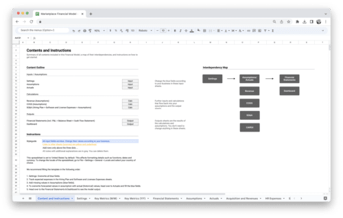
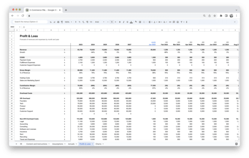
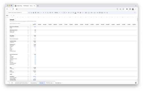
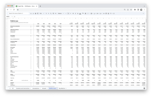
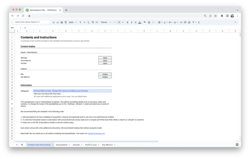
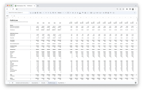
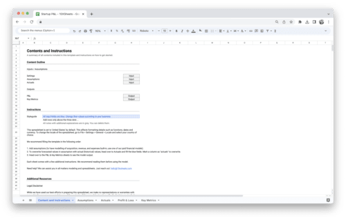
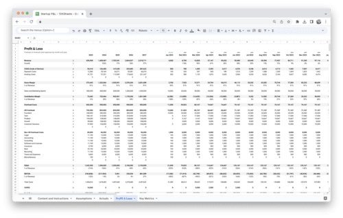
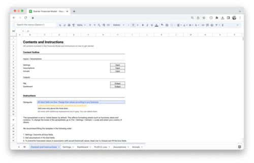
Get Started With a Prebuilt Template!
Looking to streamline your business financial modeling process with a prebuilt customizable template? Say goodbye to the hassle of building a financial model from scratch and get started right away with one of our premium templates.
- Save time with no need to create a financial model from scratch.
- Reduce errors with prebuilt formulas and calculations.
- Customize to your needs by adding/deleting sections and adjusting formulas.
- Automatically calculate key metrics for valuable insights.
- Make informed decisions about your strategy and goals with a clear picture of your business performance and financial health.